Case Study
Dinner Spinner
Mobile App UX Design at Dotdash Meredith. 2022.
The Allrecipes Dinner Spinner had been around a long time, since 2008, back before many got their first iPhone. It was about as legacy as it gets for the mobile app market, and over the years it had seen up and down changes to its design, features, and connection to the existing web experience. When we started work on this project in 2022, the app was in dire need of some love, and its users were desperate for improvements.
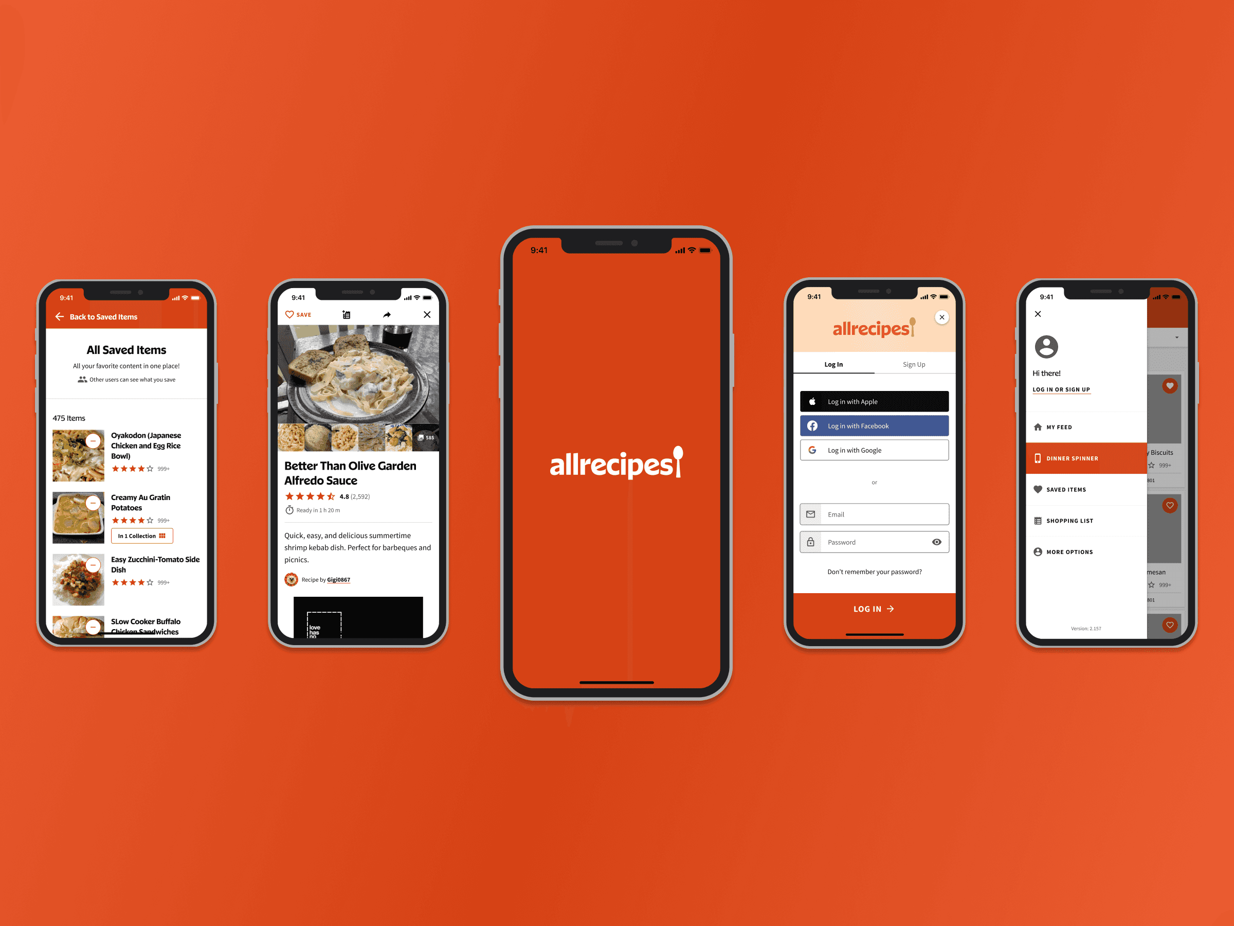
I took over as the lead UX Designer in Q1 of 2022, and led a project to focus efforts on accessibility, discover usability concerns, create new features, and to design the app to live in connection with the allrecipes.com web experience. Deliverables included: an accessibility audit and recommendations, a redesign of the Recipe Detail screen, a newly defined design system for Android and iOS, and the design of new features such as Saved Items & Collections, and the Shopping List.
Timeframe:
Q1 2022 — Q3 2022
Role:
Sr. Lead UX Designer
Platform:
iOS/Android/iPad
Category:
Food, Social

A collection of screens from the app before our work, showing a range of design inconsistencies and accessibility failures.
The most pressing matter to address was Dinner Spinner's many accessibility failures. The app, originally designed by a third-party, improperly used the AR brand colors, leading to a number of contrast failures. Past contrast, the app also lacked appropriate signifiers for many of its affordances due to poor color, iconography, and visual hierarchy.
The first step in this process was a lengthy accessibility audit, wherein I walked through our 25+ screens, labelling any failures, while also pointing out any room for improvement. While we needed to hit AA standards per the WCAG, I wanted to push that boundary further, and ensure the most usable experience for our wide range of 1.4 million+ annual users.
With those ideas in mind, I worked alongside our brand and dev teams to create a cohesive vision for the future of the app, ultimately resulting in a new design system to ensure our accessibility compliance now and forever into the future, as well as to create a unified visual language to enhance the app's usability.
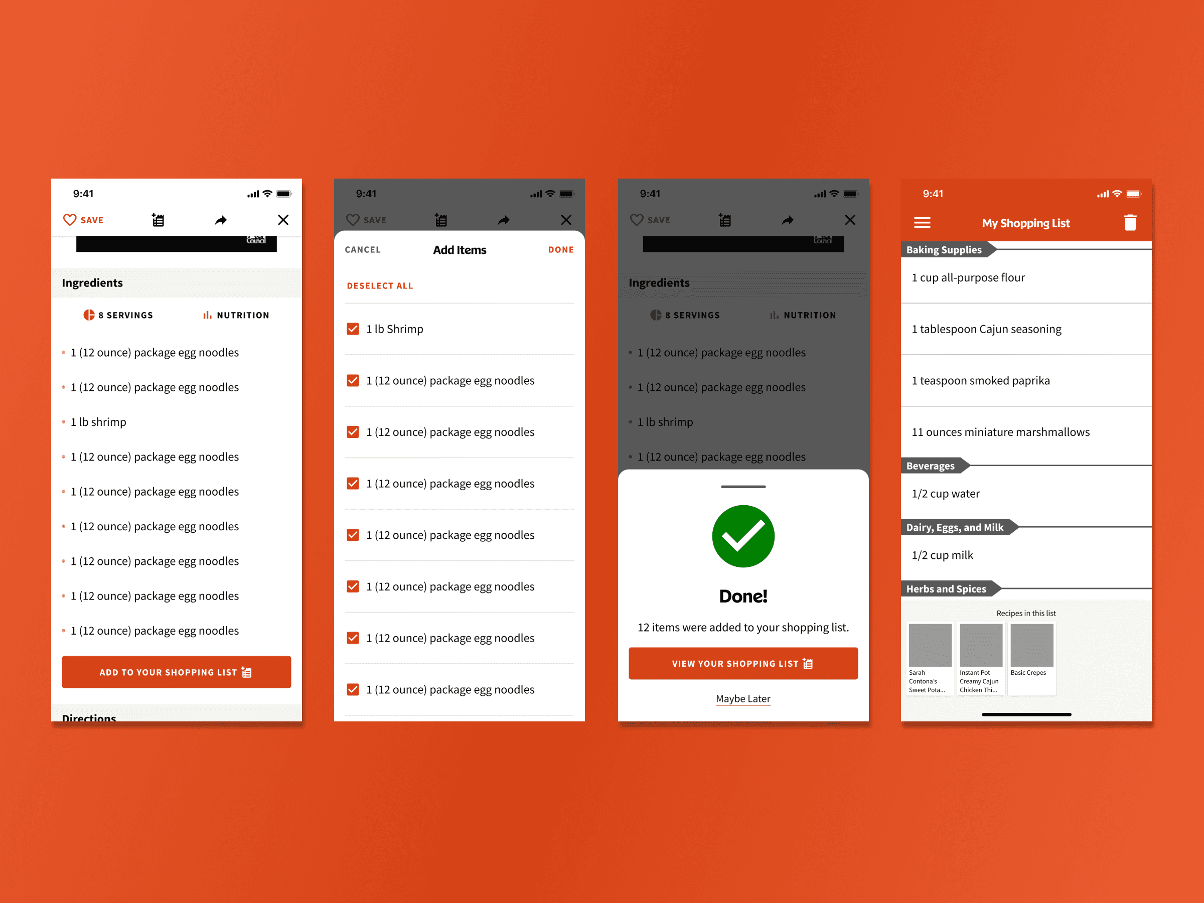
Here, the flow of adding some or all ingredients of a recipe to your shopping list were simplified, and designed to best fit a mobile app experience.
With the redesign, we needed to improve our core features first, before moving onto our newest ideas. That started with a full redesign of the Recipe Detail screen, our most important, and most visited screen in the app.
Imagery was given more space to breathe, elements were given appropriate contrasts and placed in a distinguishable visual hierarchy, and we further fleshed out some core elements such as the shopping list.
We designed the new add ingredients flow to both simplify the process for those quick users who want to add them all immediately and move on, as well as to provide further possible control to those who want to pick and choose certain ingredients, like those who may want to remove their pantry items (salt, pepper, etc.) from their shopping lists.

Saving would no longer be a single-use function, as we designed the add to collections flow to allow users to create and customize collections of recipes for any purpose.
Once we had settled on a design system, and completed development of our redesigned core screens and functionality, we turned towards new features, and the future of the app. A main point of concern was how to keep the app and website experiences connected, for our home cook users to best take advantage of what Allrecipes has to offer.
The biggest feature related to that thought was Saved Items & Collections, which allows users to save recipes in multiple places, and to create unique sets of recipes that best serve their needs. We wanted to port this feature over to the app, but needed to ensure we took advantage of the mobile app experience.
Our new Add to Collection flow was designed with the same core functionality, but enhanced usability in a few areas, such as visual presentation to ensure users knew what recipe was going to which collections, and a simplified management system for shifting recipes from one collection to another.
Having accomplished our major goals for this product, we turned our sights towards the future of the app, and the design of new features to continue to improve the home cooking experience for chefs around the world.
Retrospective
This project challenged me in new ways, leading me to a deeper understanding of the mobile app design process and the complexity of creating a multi-medium digital experience, especially one like Allrecipes, which has an extremely loyal, but passionate community of users.
It was an exciting project through and through, and I look forward to further app experiences in the future.