Case Study

Product Design at Occasion Brands. 2019.
Occasion Brand's partnership with Kleinfeld came together quickly, and so did their first site. Rushed together with an amalgam of components from OB's other sites, the first Kleinfeld Bridal Party lacked a unique design sense, trailed in accessibility, and was a nightmare for responsive screens.
For V2, we redefined the User Experience and develop a brand built for the web with a focus on accessibility, discovery, and conversion.
Timeframe:
2 months
Role:
Product Designer
Platform:
Responsive Web
Category:
E-commerce, Fashion

The old homepage design for Kleinfeld Bridal Party, featuring the old logo, old navigation with no dropdown, and a homepage that featured no live elements – just images.
Research into improvement of the conversion funnel led to a number of improvements, including: a slimmed-down checkout flow, enhanced functionality on the product detail page, and a refined categorization system for users to find their specific product amongst our large catalog.
Research suggested that a checkout with 7+ steps could result in as much as 35% greater abandonment. Looking at our own analytics, I saw that our users were spending upwards of 2 minutes and 30 seconds just filling in their information. There are certainly other reasons why they may hover here, but it was still clear that slimming this down would expedite their process, increasing the likelihood of making a sale.
I redesigned the checkout page by trimming down unnecessary fields, adding explanations for why we require seemingly personal information, providing greater product details directly on the page, and adding formatting to the credit card fields in order to simplify filling in those 16+ digit strings.
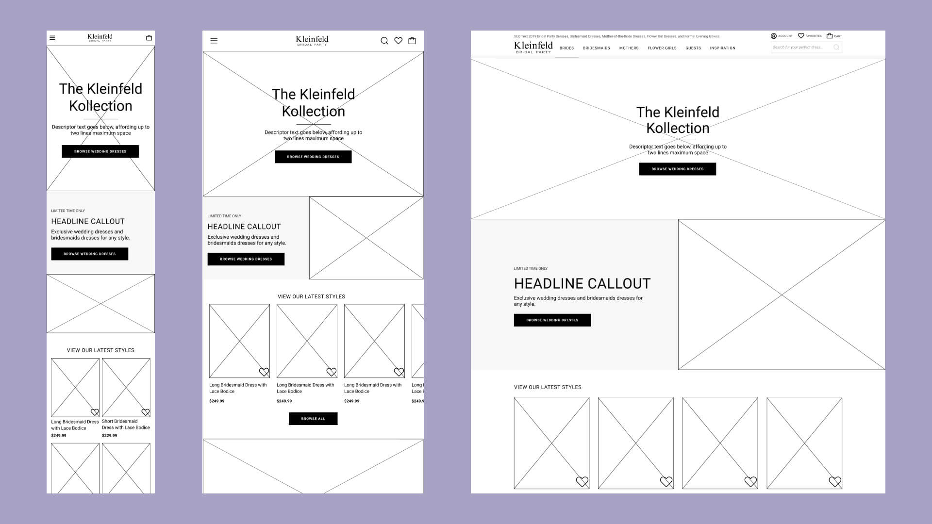
One of the later passes at wireframes for the KBP homepage for mobile, tablet, and desktop. A heavy emphasis was placed on product imagery, not needing to "sell" the Kleinfeld name.
Hover-zoom is an industry standard on Product Detail Pages. This was not news to us, but we had run into development issues in the past and tabled it for later. To ensure this feature was included in V2, we put together a comprehensive storyboard, ensuring that the feature would meet the needs not just of our users, but of our internal teams, so that they could prepare the correct imagery that wouldn't appear pixelated upon zoom.
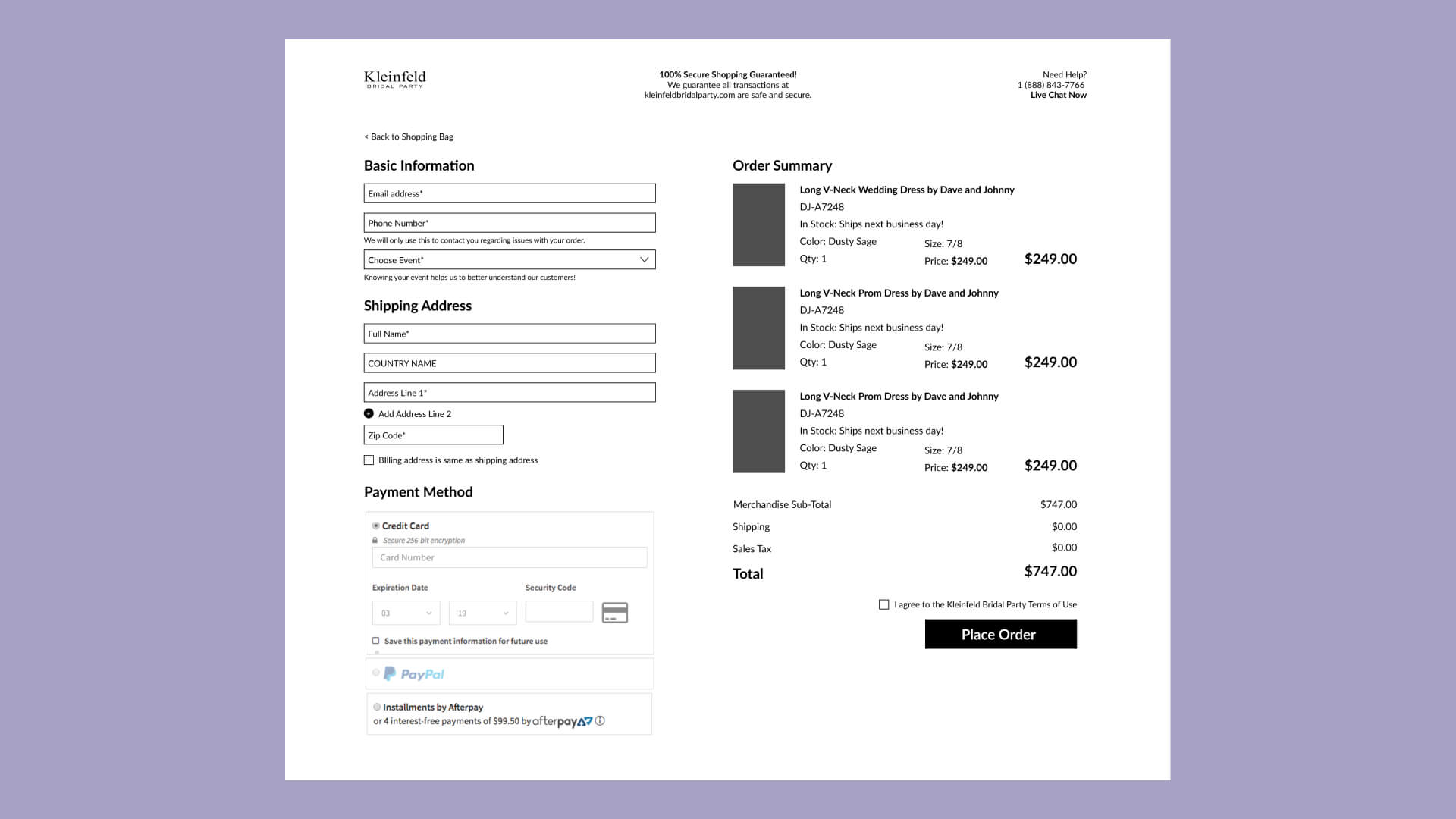
The new single checkout page, trimmed down by removing fields that can be replaced, such as by using the zip code to locate city and state, and eliminating fields such as gender.
Categorization was a more massive undertaking. 30+ new pages had to be developed, requiring the work not only of our developers, but also of the merchandising teams. Merch had to prepare and identify the assortment of categories they required, and we had to then work with them in order to create the correct labeling system in OB's backend. Following all this came the content specifications for these pages, including imagery and messaging.
As a team, we developed the storyboard layout for the pages, prepared the documentation for the development team, and created the extensive list of acceptance criteria. Creating all of these pages required a serious overhaul of our navigation too, and so we redesigned the hierarchy of links within it, all while paying mind not to overload our users with too many options.

The new drop-down mega-navigation (left) and an example Category Index Page (right).
Reaching accessibility standards was a bit of a catch-up game for OB. The other sites in their portfolio had just recently been redesigned to pass accessibility tests, and they had really just hit the bare minimum. Designing for accessibility is a personally vital endeavor, and so I took the task of ensuring such standards were both met and exceeded.
The old sites suffered generally from poor contrast, making elements on the page difficult to see. This was in addition to a dated philosophy on typography, with many of the font sizes below a readable standard, center-aligned, and excessively spanning the full-width of each page.
To address contrast, I worked with our partner Paper Tiger to redefine their first pass at branding colors. The first choices didn't even pass WCAG's AA level, so we deliberated back and forth until we hit AAA. It came at the cost of one of their color choices, but we agreed the design was better off.

The new accessibility-checked style guide (left) and typography standards (right).
Typography improvements required setting standards in the style guide to carry across all pages, both new and old. Font sizes for long-form text was increased drastically, and limits were set on the maximum-width of such elements, in addition to an increased line-height to give the text some space. Caption-style text was allowed to be minimal, but had to be used sparingly for less-important purposes, so as to not inhibit the user journey.
Step-by-step, our product plan came together, and we pushed forward with development. We created an expansive list of sprint tasks, full of their own user stories, documentation, and acceptance criteria. Naturally, that long list took some time to get through, spanning over the course of three two-week sprints.
Following a copious amount of testing, stakeholder discourse, and conversations with the developers, we were finally able to go live with the new site in March of 2019. Accessibility standards were met, user discovery was at its best with improved navigation and categorization, and the funnel was easier than ever with an improved checkout process.

The new KBP homepage, featuring the new mega-navigation, enhanced search, and a homepage with interactive elements.
Retrospective
Easily the most difficult aspect of this endeavor was the number of stakeholders, especially the amount of external partners. They were often not on our same schedule, difficult to track down, and unfortunately in charge of making final decisions on many aspects of the redesign. This led to some last-minute rescheduling of our annual roadmap, and a bit more stress than necessary.
To me, it was a wake-up call to reorganize our roadmap, and to always afford for unexpected turns. It was obvious that our best work would come out if we aimed to complete everything on the product side at least one sprint before it would go into development. Easier said than done, of course, but we still pushed for it as much as possible, and began creating more room in our roadmap for the rest of the year.